
Case Study: Kidcare Net
UX/UI Design
Project Overview
Kidcare Net is a mobile app for parents who have trouble looking and screening babysitters by giving them a centralized place to find babysitters with detailed information on their background and skills. I’ve conducted interviews, white-paper research, wireframes, prototyping, and usability testing during the development of this app. The biggest challenge I encountered during this project was thinking of ideas and finding/including necessary features to help caregivers the comfort of getting a great babysitter.
My Contributions
Lead UX Designer, Researcher + User-testing, Wireframing, Prototyping, High-fidelity UI
Project Duration
July 2022 to September 2022
Step 1: Research
Secondary/White Paper Research
Before fully committing to this project, I began by conducting white paper research to explore the world of babysitting. My goal was to determine whether there were significant issues within the industry and, if so, to identify the challenges caregivers faced.

Interview Process
To solidify my white paper research, I conducted interviews with caregivers, including three sets of parents. My goal was to understand the various methods they used to find babysitters, how they vetted them, and the key traits they valued in a sitter. An interesting insight that emerged from these interviews was the importance of compatibility between the babysitter and the children.
Finding a babysitter
Many parents shared that finding a babysitter is challenging. All of them stated that their first approach was word of mouth, yet only one parent considered using the internet or an app for their search.
Getting a qualified babysitter
One set of parents shared that their child has special needs. They explained that they had tried multiple babysitters to see who would effectively attend to their child’s needs. While they found some success, they emphasized how helpful it would be to know a babysitter’s characteristics and skills in advance.
Incompatible babysitter
All of the parents mentioned it was hard to get a good match for their child. Their personality would be opposite of the kid, couldn’t speak the same language or communicate, or wasn’t pet-friendly.
Competitive Analysis
Before I started designing, I wanted to find the current state of the babysitter finding market. Some of the questions I asked myself were:
How saturated was the babysitter market?
What were the reviews the competitors were getting?
What is their value proposition?
What are each other their strengths and weaknesses?

Step 2: Empathize
Target Audience
Before entering the empathizing stage, I first needed to identify my target audience. While my interviews were primarily with middle-aged parents, I didn’t want to limit my focus. Instead, I aimed to create something that could be useful for all parents, especially those seeking more than just a general babysitter.
Personas
I developed two personas to better understand my users. One represented the average parent, while the other depicted a parent seeking a babysitter with specialized skills beyond general childcare.
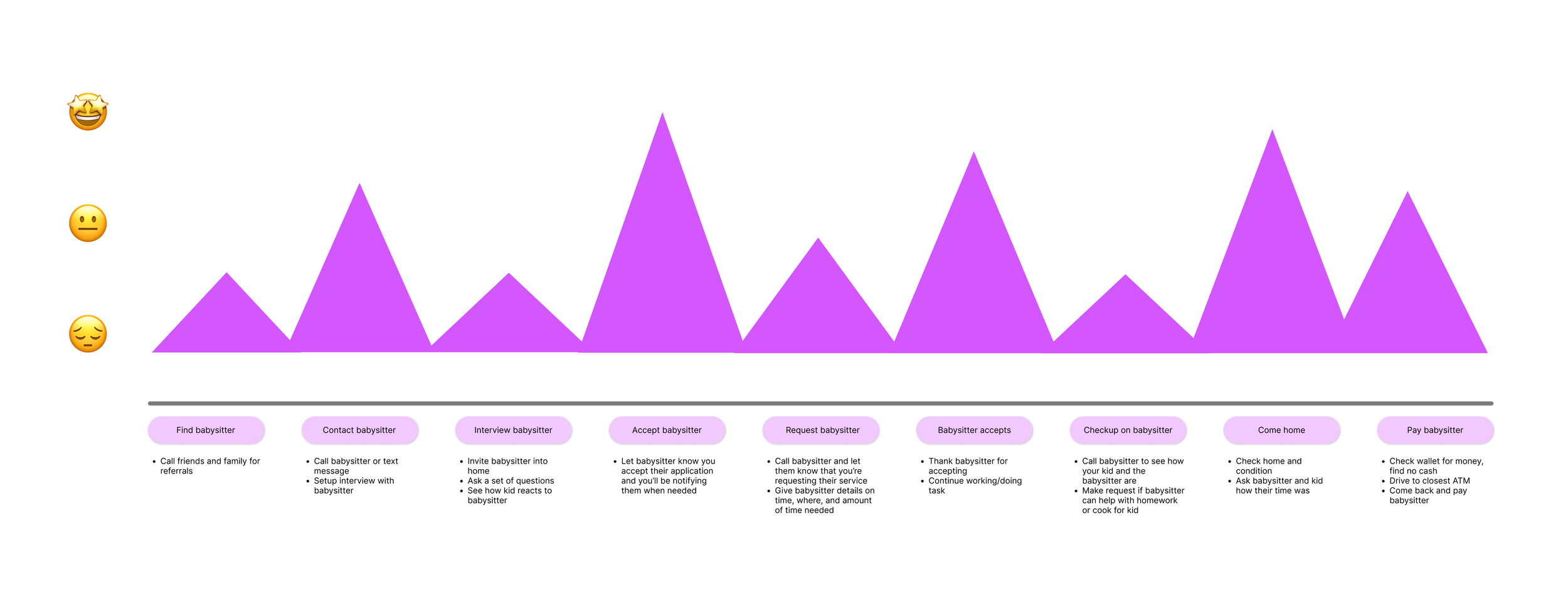
Journey Map
This journey map was created using information from the interviews I conducted. By capturing the user’s pain points and points of delight at each stage of the process. I could create of solution based off which points need improvements.
Areas of Improvement
Based off my research and empathizing. I discovering common themes between the information found, I wanted to answer these statements:
How might we help parents find the best best babysitter possible in order to help them feel more confident about their choices?
How might we improve the interview process in order to help the parents save time?
Finding the Perfect Fit
By giving users an expansive filter, users will be able to find a babysitter they want based on their preferences, certifications babysitters may have, and skills they possess.
Communication w/ Babysitters
By having easy communication with babysitters this should improve the user’s experience during two points: the screening/interview process and checking up on them during a session.
Step 3: Ideating
By using the “How Might We” statements to brainstorm, I came up with ideas that address the user’s pain points and distinguished those ideas into what is necessary and what is a feature.

Step 4: Design / Prototype
Paper Wireframes
During the creation of my paper wireframes there were two things that I focused on the most: keeping the user flow simple and what information should be displayed during the user flow.


Refining the Design
This is my first iteration of my mockup. It took me approximately one week to complete and polish it. For the primary color of the app, I decided to go with purple because most of the competitors used purple as their primary color as well. When I noticed this, it made me curious and I dove deeper. What I found was purple meant represented stability in many cultures due to its mixture of a calm blue and fierce red. The interpretation is that blue is the parent and the familiarity and red is the babysitter but mixing created stability even though the environments differ.
Step 5: Test
Usability Findings
To test my design I conducted a usability study consisting of five participants. The goal of the usability study was to see how long and easy users could complete tasks, UI design, and the usefulness of the app. In addition to the study, I also created a Maze usability study and sent it to friends, people who would be actual users, and a forum to get more feedback on my design. The study was done over a span of three days and what I found was:
1. Easy to use
“Very straight forward, that was easy to use.”
“And we’re done, that was simple.”
2. Way to view current/previous bookings
“Viewing my favorites is cool, but I think it’d be more useful if I could view my own bookings.”
3. Implementing child safety
“What if there is an issue with the babysitter that goes beyond just giving a bad review.”
Usability Results
Usability Averages

Screen Findings

Using Feedback to Improve
View current bookings
The ‘Favorite’ button was switched to a full functioning ‘Bookings’ button that shows current and previous bookings.


2. Implementing child safety
Users may now report a babysitter if needed through booking history, prior to the usability study they were only able to rate a babysitter.


3. Improving buttons
Display buttons on the filter page were changed to purple. Users expressed how they correlated purple buttons to larger or more important tasked buttons.


Visual Upgrade (Updated October 12)
High-Fidelity Prototype (Updated October 12)
Reflecting on everything
As my third UX project, and last for my Google course I wanted it to be for a community good. The most challenging part of this project was a combination of the research and the solution. The general solution would be a centralized app for finding babysitters within the GTA but the market for that was somewhat saturated, and I wanted to come up with something different that would extend the audience. To do that I had to do in-depth research and use most of the apps first-hand to really experience them.
What was also challenging was refining my design. While conducting my usability study I was able to get other UX designers to critique my designs. Some valuable insights I learned during that usability study were: proper spacing, having fun with your designs, and being able to keeping your design consistent and concise. I found the usability studies extremely valuable because the idea of viewing current and previous bookings was pitched to me and to find out if other users wanted the feature, I conducted a survey. This was honestly very helpful when creating the next iteration of my designs.
Overall, this was the most fun I have had with a project so far. I enjoyed my other projects but this one was most special because what inspired this project was close to home. I have a lot of friends and family who now have children, and through my conversations with them this was the one topic that was brought up in every conversation. And never has it ever crossed their mind to ever use an app to find a babysitter so I hoped that this project would change their mind.